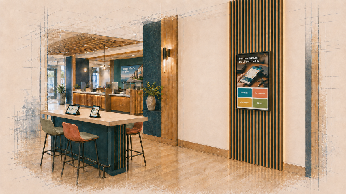
An East Coast community bank had recently redesigned several branches as more open, flexible environments intended to support more than traditional transactions. One of those locations included digital signage throughout the branch, along with a wall-mounted interactive kiosk beside a collaboration and discovery area.
The kiosk was seeing little use, and the bank brought me in to review the content and determine what should be replaced, redesigned or removed.
That sounded like a content question. Once I looked at the kiosk in the context of the branch, a more fundamental question emerged:
What was this screen supposed to help a customer do?
Customers Were Supposed to Explore. But Explore What?
This was the only branch in the bank’s network with digital signage. Most of its locations were traditional branches with printed posters, conventional teller lines and no digital displays.
This branch had been designed differently, with digital signage, a seating area, a discovery table and the interactive kiosk. The expectation was that customers would approach the kiosk and explore on their own.
But “self-exploration” described how someone might use the screen. It didn’t explain why they would use it.
Explore what? For what reason? What would happen afterward?
There was no defined next step. The interaction wasn’t connected to a staff conversation, an application, an appointment, a handoff to the customer’s phone or a particular branch service. The bank had a touchscreen full of things customers could browse, but no compelling reason for someone entering the branch to browse them.
A useful role would need to be much more specific. For example, the kiosk could:
- Help someone identify which service fits a need before meeting with a banker.
- Help a customer prepare for a conversation they already came to have.
- Surface a relevant branch service and provide an immediate next step.
- Allow someone to complete a useful task independently.
Those are very different interactions. They require different content, placement decisions and definitions of success. Without first deciding which one the kiosk was supposed to support, improving the content would still leave the bank guessing about whether the screen was accomplishing anything useful.
The Location Was Asking for a Different Behavior
The kiosk sat near one of the branch entrances beside a long table described as a collaboration and discovery area. That sounded sensible on a floor plan, but in practice the same area also functioned as a transition path. Customers entering from that side passed the table and kiosk on their way toward the teller line, which was the more obvious destination.
Someone walking into a branch is already trying to answer immediate questions:
- Where do I go?
- Who do I speak with?
- Where is the teller?
- Am I in the right place?
The kiosk was asking that person to interrupt the task already in progress and begin exploring something else without knowing what that exploration would provide.
The nearby seating created another issue. If another customer was sitting at the table, what would someone feel comfortable exploring on a large screen? Privacy isn’t limited to entering an account number or other personal information. A customer may also be uncomfortable with someone nearby seeing that they’re looking at debt consolidation, mortgage affordability, retirement planning, business financing or credit-building options.
Placement therefore affected whether someone would stop, how long they might stay, what subjects they would comfortably explore and whether the expected behavior made sense in that part of the branch.
It also suggested another role for the screen. People moving through the entrance area had very little dwell time, but customers sitting nearby could still see the display without approaching it. The screen could surface a recognizable question, financial situation, branch service or useful prompt while someone was walking past or sitting nearby, then give them a reason to continue if the subject was relevant.
The touchscreen didn’t have to rely on physical interaction as the first step every time.
Staff Couldn’t Easily Become Part of the Interaction
The branch still had a traditional teller line, and the bank intended to keep it. Employees couldn’t easily move from behind that line into the collaboration area because the path out ran through another office, which might already be occupied for an appointment.
If the kiosk was supposed to lead to conversation, that created a practical problem. A customer could explore something on the screen and develop a question, but there was no natural transition to an employee who could easily join them.
The bank also didn’t want to change staff behavior around the kiosk, which narrowed the options further. Any interactive role now had to work without an employee inviting someone over, explaining why the kiosk was useful or stepping in afterward.
A customer would need to:
- Recognize why the kiosk was useful.
- Understand what to do without assistance.
- Get something useful from the interaction.
- Know what to do next.
The existing content didn’t meet that test.
The work also expanded into conversations with the branch team. If the screen was going to surface something useful without relying on an employee to introduce it, the content needed to reflect what customers actually asked about and what repeatedly came up in branch conversations.
Useful questions included:
- What questions do customers repeatedly ask?
- What do people often arrive not knowing?
- What information would make certain conversations easier?
- Which branch services or options do customers regularly overlook?
- What questions come up while people are waiting or preparing to meet with someone?
Those answers could inform what appeared on the screen in the discovery area. That is different from simply filling the display with product promotions. A passive message could begin with a question customers already ask, an issue they commonly misunderstand or something employees regularly wish people knew before a conversation starts.
Private Continuation Became Part of the Review
The privacy issue also changed what a useful next step could look like.
If someone noticed a relevant topic on the screen, it didn’t necessarily make sense to ask them to complete a long financial exploration on a large public display. The review therefore began considering ways for someone to continue privately rather than conduct the entire interaction on the kiosk.
Possible directions included:
- Scheduling an appointment.
- Sending information to themselves by text message.
- Moving the interaction onto their phone.
- Beginning a short task at the screen and continuing elsewhere.
The text-message option became particularly interesting because it reduced the need for someone sitting nearby to stand up, walk over to the kiosk and visibly browse a financial subject in front of other people.
None of those directions had been implemented as part of the review. They were options being evaluated against the actual conditions of the branch.
The bank now had to decide how much of the interaction belonged on the public screen at all.
Faster Content Would Still Leave the Main Question Unanswered
The branch also had limited bandwidth, and web-based content didn’t always load consistently. That made technical performance an obvious suspect.
There were ways to improve it. Content could be cached locally, interactions could be lighter and more purpose-built, and dependence on web pulls could be reduced. Those changes could remove one source of friction, but they still wouldn’t explain why a customer should stop and use the kiosk in the first place.
An underused interactive kiosk can easily become a content project at that point:
- Replace the old material.
- Redesign the interface.
- Simplify the navigation.
- Make the buttons more visible.
- Add different modules.
- Install a larger screen.
Any of those changes might improve attention or usability. None establishes a reason for the interaction to exist.
The more useful question was:
What can this kiosk help someone accomplish because they’re physically in this branch?
Until the bank could answer that, a better-looking experience could still produce the same basic behavior. People could continue walking past it, or they could tap through a few screens and leave without making a decision, starting a task, speaking with someone or taking another step the bank cared about.
Usage alone wouldn’t resolve the problem.
The Review Had to Move Beyond Content
By this point, the original content question had separated into several decisions the bank needed to make:
- What should a customer actually be able to do?
- Why would someone choose to do it at this point in the branch visit?
- Does the location support the privacy, attention and dwell time that interaction requires?
- Can the kiosk work without staff involvement, given how the branch operates?
- What should happen after someone finds something useful?
- What evidence would show that the screen was creating enough value to justify continuing the investment?
The engagement moved from which content should be redesigned to what type of interaction, if any, actually fits this location and the way people use this part of the branch?
Once the constraints were clear, the next part of the work was evaluating what the screen could realistically help someone do in that location. The client could then compare those options and decide which, if any, justified additional budget.
The Kiosk Had More Than One Possible Future
The review stopped being a question of which existing modules should be redesigned. There were several options for the screen, but they were not interchangeable or equally appropriate for this branch.
Keep it interactive, but make the role much narrower
Instead of offering broad exploration, the kiosk could focus on one specific customer need or task that made sense for the location, privacy conditions, staffing model and available bandwidth.
That could include appointment scheduling or another brief self-service action that someone could complete without prolonged browsing.
Let passive content do more of the first work
Because people could see the screen while passing through the area or sitting nearby, the display could surface questions, financial situations, branch services or useful prompts without requiring someone to approach it immediately.
Those messages could come directly from recurring customer questions and branch-team observations rather than becoming another stream of general product promotions.
Let someone continue privately
If something on the screen was relevant, the next step could move to the customer’s phone through text messaging or another handoff rather than requiring prolonged exploration on the public display.
That could be especially useful for subjects people might be reluctant to browse openly in a shared branch area.
Use the screen as non-interactive digital signage
If the location supported brief attention better than deliberate interaction, the existing screen could be used for dynamic content without asking customers to stop and navigate it.
Relocate or remove it
If the branch couldn’t support a useful role for the kiosk in that location, relocation or removal also had to remain legitimate options. Continuing to invest in the asset simply because it was already there wouldn’t make the original decision more useful.
Each option carried different implications for content, interaction design, staff involvement, privacy, technology and cost. The next budget decision depended on which, if any, actually fit the branch.
What the Branch Made Visible
The original assignment still required reviewing the content itself. The kiosk included product and service information, community news, bank history, educational material and promotional campaigns.
But reviewing those modules without examining the branch would have produced recommendations for content that still had to operate under the same conditions:
- The kiosk sat in an area that appeared purposeful in the branch design but functioned partly as a route toward the teller line.
- Customers using the nearby seating were observed focusing on their own mobile devices rather than the provided tablets or kiosk.
- Staff were physically constrained from easily stepping into the area and joining a conversation.
- People in the seating area could see the display without needing to approach it.
- Some financial subjects were better suited to private continuation than extended browsing on a public screen.
Outcome
The review gave the bank a clearer basis for deciding what to do with the interactive kiosk before committing more budget.
It produced three things the original content review alone could not have answered:
- A more specific role for the kiosk.
The screen did not need to function only as a place customers walked up to and explored. Its role could combine passive communication with a narrower interactive task that made sense for the location. - Clearer ways for customers to continue.
Depending on the subject, the next step could include appointment scheduling, sending information by text, continuing privately on a phone or completing another brief task that did not require prolonged browsing on a public screen. - A basis for evaluating whether further investment was justified.
Each option could now be considered against the same practical questions: what customers should be able to do, whether the location supported that behavior, what staff involvement was realistic, what the privacy conditions allowed and what evidence would show that the kiosk was contributing something useful.
Next Step
The client could now evaluate those options against the available budget and decide which role, or combination of roles, was worth developing further.
That could mean keeping the kiosk interactive with a much narrower purpose, using passive content to create relevance before interaction, moving part of the experience onto the customer’s own phone, using the screen as non-interactive digital signage, relocating it or removing it.
The original question had been which content should be redesigned. The review gave the bank a better question to fund: what role should this interactive kiosk play in this branch and what would success look like if the bank invested in it?