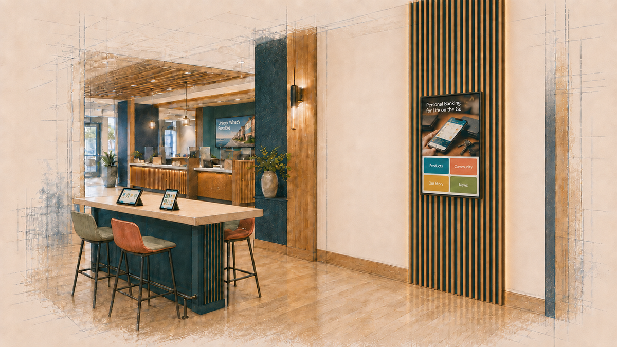
An East Coast community bank had recently redesigned several branches as more open, flexible environments intended to support more than traditional transactions.
In one of those transformed locations, digital touchpoints were integrated throughout the new branch experience, from large-format screens to an interactive screen within a collaboration area.
That interactive screen, however, was seeing little use.
The bank brought me in to review the content and determine what should be replaced.
What began as a content review led to a more fundamental question:
What were these screens supposed to help a customer do?
The Content Question
This was the only branch in the bank's network with digital signage. Most of its locations were traditional branches with printed posters, conventional teller lines and no digital displays.
This particular branch had been designed as a more modern experience. It included digital signage, a seating area, a discovery table, and a wall-mounted touchscreen. The interactive display was intended to extend that new experience.
The expectation was: customers would approach the screen and explore on their own.
Explore what? For what reason? What would happen afterward?
There was no intended next step. The interaction was not connected to a staff conversation, an application, an appointment, a handoff to the customer's phone, or a specific branch service. The bank was left with a touchscreen full of things customers could browse and no compelling reason for them to browse any of it.
“Self-exploration” sounded like the screen's purpose. It was actually only an interaction mode.
In its current state, the bank had no way to determine whether an interaction helped a customer make a decision, take a next step, or accomplish anything useful. A useful purpose needed to be defined at a much more specific level:
- Help a customer identify which service fits a need before meeting with a banker.
- Help someone prepare for the conversation they came to have.
- Surface a relevant branch capability and provide an immediate next step.
- Help a customer complete a useful task independently.
Spatial & Environmental Context
The screen sat near one of the branch entrances, beside a long table described as a collaboration and discovery area.
That sounds promising on a floor plan. In practice, the area also functioned as a transition path. Customers entering from that side passed the table and screen on their way toward the teller line, which was the more obvious destination.
Someone entering a branch is already solving an immediate problem:
Where do I go? Who do I speak with? Where is the teller? Am I in the right place?
In that location, the touchscreen was asking that customer to interrupt the task already in progress and begin exploring without yet knowing what the exploration would provide.
The discovery table introduced another question. If someone was sitting nearby, what would a customer feel comfortable exploring on the screen?
Privacy does not begin only when a customer enters personal information. Perceived privacy matters too. A person may not want another customer observing that they are exploring debt consolidation, mortgage affordability, retirement planning, business financing or credit-building options.
Placement affects whether someone is willing to stop, spend time exploring, and complete an interaction when other customers are nearby.
Operational & Staff Constraints
The branch retained a traditional teller line, an operating choice the bank intended to preserve.
Staff could not easily move into the collaboration area. The physical path out from behind the teller line ran through another office, which might be occupied for an appointment.
If the screen had been imagined as a conversation tool, the architecture made that model difficult. A customer could not be expected to explore, develop a question, and naturally transition into an advisory conversation when employees were physically constrained from joining them.
The bank also did not want to change staff behavior around the screen.
That became a design constraint.
Any viable interactive use now had to work without an employee invitation, explanation, or follow-up. A customer would need to understand why the screen was useful, complete the interaction independently, receive value from it, and know what to do next.
The existing content did not meet that test.
Technical Infrastructure Constraints
The branch also had limited bandwidth. Web-based content did not always load consistently, which made technology performance an obvious suspect.
Content could be built for cached playback or designed around lighter, purpose-built interactions.
Improving load times could remove one source of friction. It still would not answer the central question:
Why should a customer stop and engage with the screen?
When a screen is underused, the instinct is often to make the experience more attractive and assume usage will follow:
- Replace old content with new content.
- Find workarounds for database or HTML pulls.
- Change the design.
- Make the buttons brighter.
- Install a larger display.
Design and content can improve attention and usability. They still cannot answer:
What can this interaction make possible because the customer is physically in the branch?
The Questions Beneath the Content
What looked like a content problem was actually a set of unanswered experience questions.
What should the customer be able to do?
What specific role should the screen play in the branch?
↓
Why would they choose to do it here?
What behavior does the experience expect, and does the location make that behavior reasonable?
↓
What happens next?
Where should the interaction lead, whether that means self-service or a conversation with staff?
↓
What useful outcome does that create?
What becomes easier or more valuable for the customer?
↓
How would we know?
What evidence would show that the screen actually performed that job successfully?
The bank had the hardware and the content, but those decisions had not been connected into a complete experience.
That made “nobody uses it” both true and insufficient.
More usage would not necessarily solve that problem. Customers can tap, browse, and move through content without making a decision, taking a next step or creating an outcome the bank actually cares about.
Strategic Options & Off-Ramps
The next decision was no longer which modules to redesign. The bank first needed to choose among several legitimate futures for the asset:
1. Keep it interactive and give it one narrow purpose
Design a self-contained experience suited to the location, privacy conditions, staffing model, and available bandwidth. Remove modules that do not support that purpose.
2. Redefine it around the transition zone
Instead of expecting open-ended product exploration, use the screen for something valuable during the first moments after arrival. That might include orientation, branch-specific services, preparation for a conversation, or a task that can begin there and continue elsewhere.
3. Convert it to non-interactive digital signage
If the location supports brief attention better than deliberate interaction, dynamic digital signage may be the more useful application of the existing screen.
4. Remove or relocate it
If the environment cannot support a clear role for the screen, preserving it simply because the bank already paid for it compounds the original decision.
None of these directions begins with a content refresh.
What the Review Changed
The initial request was simple: review the existing interactive content and recommend what should be redesigned, added, or removed.
The review did evaluate the existing product and service information, community news, bank history, educational articles and promotional campaigns. But the recommendations could not stop at the content itself.
The report documented the conditions that would determine whether any new content could succeed:
- Spatial Friction: The screen sat within a discovery area that looked purposeful on a floor plan but functioned as a transition path in practice. Customers entering from that side often walked past it without engaging.
- Observed Behavior: Customers who used the nearby seating focused on their own mobile devices rather than the provided tablets or touchscreen.
- Operational Barriers: Staff members were physically constrained behind the teller line and could not easily step into the space to initiate or join a conversation around the display.
That gave the executive team a different decision to make before commissioning another round of content. The report identified several viable roles for the asset, each grounded in how the branch actually operated:
- Self-Guided Discovery: Refine the screen into a focused tool for product exploration, digital adoption or onboarding.
- Community & Education Hub: Use the screen to support workshops, financial education and community activity in the space.
- Dynamic Signage: Shift the display toward non-interactive content that can surface relevant needs, prompt questions, and connect with the broader in-branch signage experience.
- Relocation or Removal: Recognize that the current location may not support meaningful interaction and reallocate the asset where it can perform a clearer role.
Each path required a different content strategy, placement logic, staff workflow, definition of success and measurement approach.
The leadership conversation was no longer limited to which modules should be redesigned. It could now address the more consequential questions:
- What role does this area actually play in the branch experience?
- What customer behaviors naturally occur here?
- How should dynamic signage, interactive technology, and staff roles work together?
- Which path justifies the next round of investment?
Before investing in another round of content, the bank now had a way to determine whether the screen had a viable role in the branch at all.
If You’re Reviewing an Underused Interactive Experience
I can help you determine whether the issue is content, placement, purpose, branch type, or the experience itself, then define what the interaction should help customers do, what should happen next, and how you’ll know it is working.